
Improving Moderation's Onboarding
14 March 2020One of the design goals of Moderation is to make the food logging experience as simple as possible. I generally find most onboarding screens annoying, and a hindrance to letting the user start discovering the functionality of your app by themselves. I purposefully didn't include an onboarding process when I released Moderation as I had assumed the concept was simple enough to understand just from the UI.
I was wrong.
Whenever I showed the App to people, most people could figure out how to use the UI, but a lot of them needed an explanation of the different paradigm of Healthy/Unhealthy vs traditional calorie counting. I found myself giving the same sales pitch over and over, but after the explanation, most people were very receptive and thought it was a good idea.
When I eventually got around to measuring some stats, well over 20% of people who opened the App never actually logged a meal
Designing the Onboarding
I knew there were certain onboarding behaviours that I didn't want to implement when I set out to design the initial onboarding experience:
- I didn't want those horrible arrows or simulated hands to show you what to click and where. I think if your UI is so complicated that it needs those types of instructions, then it is not good enough. I also think that simply showing them how to use the App, is very different from guiding them through why they want to use the App, which was my goal.
- I didn't want to throw up any modals or permission requests. Luckily, I don't require an account to use Moderation, but I have no doubt that any form of modal is going to drastically decrease the throughput of the onboarding, and I wanted them to be able to get through the screens quickly.
The Onboarding Process
The following screens were designed:
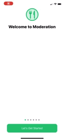
- Welcome - Highlight the key selling points of the App, to remind them what is different about Moderation.
- Motivation - Capture their main motivation for the App. This screen also indirectly helps explain that the App can be used for any type of eating goal.
- Information - Based on their selected motivation, this screen shows them why using Moderation is a good fit for that goal.
- Save Time - I think of the biggest selling points is how simple and quick logging food is with Moderation. However, people have become accustomed to calorie counting and scanning barcodes, so this screen addresses why Moderation takes a different approach.
- Simple Logging - Following on from the last screen, this screen identifies that it is as easy as selecting Healthy or Unhealthy to log a meal.
- What is Healthy? - Finally, this screen explains the concept of the App that usually needs the most explanation. It clarifies that what is Healthy is unique to your personal goals and judgement.
The results
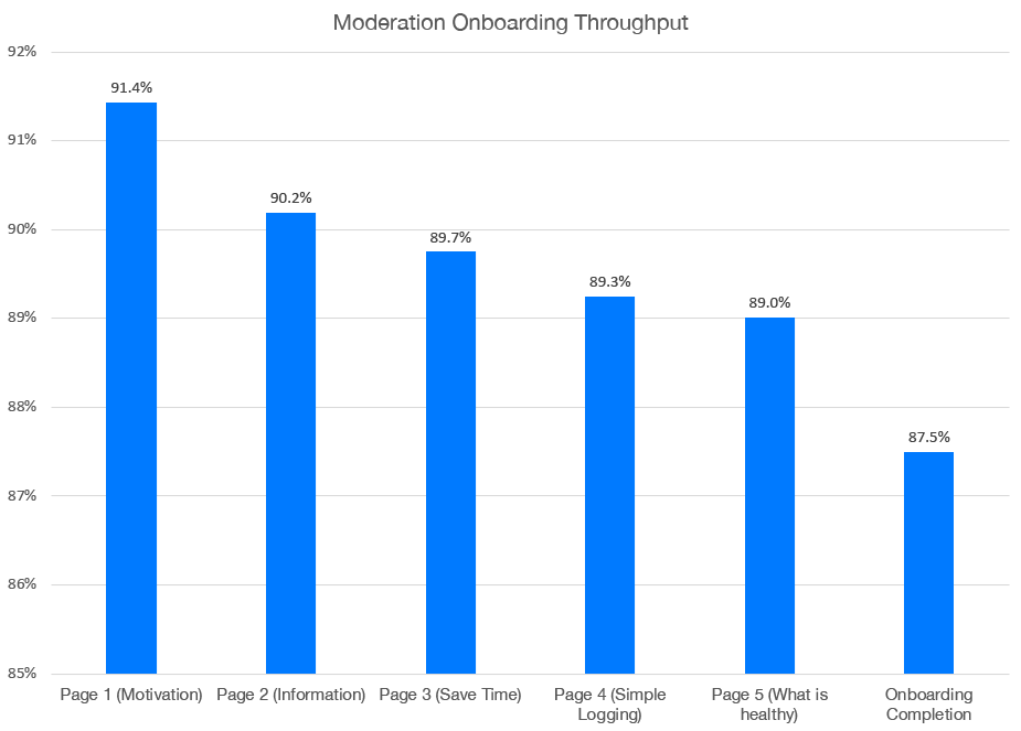
- 87.5% complete the onboarding experience. Is a 12.5% drop off good or bad? I'm not really sure.
- Dropoff across each screen is relatively consistent, except for a few exceptions:
- The initial Welcome Screen > Motivation screen has a dropoff of over 8%. Not too surprising considering it's the first page. How does this compare with other Apps?
- The 'What is Healthy' screen drop off has the highest drop off of all the other pages. Is it one page too many? Is the explanation of Healthy/Unhealthy still confusing for some?
In terms of the ultimate measure, what I want is more long term engaged users. Moderation has 'achievements' which has come in handy for this analysis. It allows me to track two basic engagement measures:
- Completed First Day (Logged 3 meals on a single day) - This increased by 8.9% (comparatively)
- Completed a Week - This increased by 68.1%! (comparatively)
Overall, it looks like the onboarding experience has helped improve the likelihood of people staying around and logging more meals.
What's next?
Based on what I have discovered, there are a few things I'd like to change in the future:
- Add a skip button to the initial onboarding screen, to try and reduce the initial 8% drop off.
- Try and combine the Simple Logging and What is Healthy screens to reduce the number of screens.
- On the Simple Logging screen, there are two disabled dummy buttons to illustrate what the Healthy and Unhealthy buttons look like. A surprising number of people try and tap these (over 25%). This may show they are confused and expect to be able to log a meal at that stage in the process.
- Add a 'More Info' option to the 'What is Healthy?' screen so if they still don't understand, they can read a longer explanation about the philosophies of Moderation.